
Bunji: safety-first navigation
A safety-first routing experience that helps travellers move through unfamiliar cities with more confidence using safer routes, safety tips and real-time alerts.
2018
-
2-week concept project
· Solo Project · App Design ·
Scroll
Overview
My role
UX & UI
Team Composition
Solo Project: research → synthesis → MVP → prototyping → testing → final UI
When people arrive in an unfamiliar city, most navigation apps optimise for speed, not peace of mind. Bunji was created for travellers who want to reach destinations efficiently while avoiding streets or areas that feel unsafe — building situational awareness especially when they lack local context.
This case study reflects my end-to-end process, from research and problem definition to MVP strategy, information architecture, prototyping, testing and final high-fidelity UI. The goal was to make safety guidance feel actionable and calm at the moment of route decisions.
Challenge
Travellers need a way to understand what is happening around them in real time so they can move through a new city safely and confidently.
Business Goals
Build trust in navigation by helping people make better route decisions before they enter an uncomfortable or risky situation, while still keeping the experience efficient and easy to follow.
Key Pain Points
01
Safety anxiety when navigating unfamiliar neighbourhoods.
02
Lack of situational context during route selection, people only realise "too late" that a route feels wrong.
03
Cognitive load while on the move: limited attention, time pressure and distraction.
Problem to solve
How might we help travellers understand what is happening around them in real time so they can navigate a new city safely and confidently?
Discovery
To understand real traveller behaviour (not assumptions), I ran both quantitative and qualitative research.
Research and discovery methods used:
Online survey: 69 responses
Semi-structured interviews: 4 participants

Research Discovery
01
Worried about safety
71,8%
02
Survey respondents
69
"I am quite oblivious and whenever I am traveling I always end up in uncomfortable and unwanted situations."
Key Insights
Highest-value moment before committing:
Safety is not a niche concern and the highest-value moment is before committing to a route, not mid-navigation.
Clear safety information:
Safety information must be lightweight and decision-ready, not fear-inducing.
Balanced safety and efficiency:
The experience must balance safety and efficiency. It cannot feel like a detour-first product.
Strategy
I translated the research into a clear product strategy and an MVP that could be validated quickly. The priority was to design the safety layer so it complemented the core navigation loop — instead of competing with it.
Strategy methods
Affinity diagram
Clustered themes from survey and interviews to find patterns.
Empathy map
Used to capture anxieties, behaviours and decision triggers.
Persona
Used to represent the target user's context and constrains.
User Journey
Identified high-stress moments and key intervention points.
MoSCoW prioritisation
Used to establish a focused MVP on safer route suggestions, contextual safety tips and real-time alerts.
Sitemap + User flow
Used to established a happy path: Set destination → Compare routes → Navigate → Reroute.


Solution
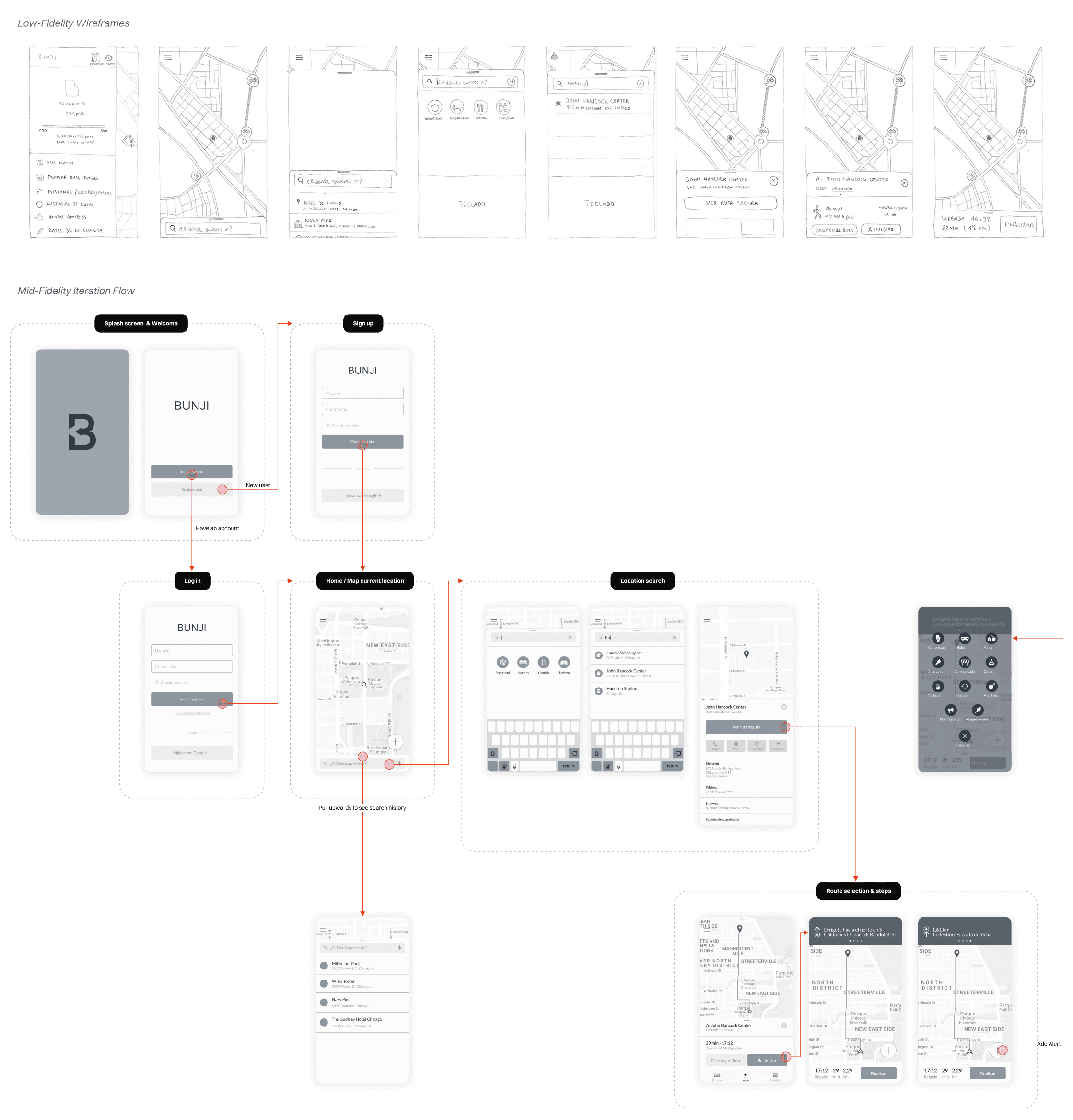
I designed through progressive fidelity to validate the navigation model early, iterate quickly and reduce costly rework.
Low-fidelity wireframes: used to explore layout and content hierarchy without visual distraction.
Mid-fidelity wireframes: used to validate structure and interaction patterns for route comparison and alert states.
Interactive prototypes: to enable realistic task-based usability testing.
High-fi UI: to polish and apply the final design.
Key screens narrative
Route comparison screen:
The critical decision point. Safety context and route options are surfaced together so users choose confidently before starting.
Progressive disclosure:
Tips and alerts appear contextually to avoid overwhelming the user with fear-based content, minimising alarm fatigue.
Scannability under stress:
Clear hierarchy, consistent alert components and readable typography support on-the-go use when attention and time are limited.
Testing
Task-based usability testing with people from the target group across prototype iterations. Observed confusion, hesitation and collected qualitative feedback.
What usability testing helped uncover
Where users misread safety indicators or hesitated between route choices.
Which alert states required clearer language or more distinct visual treatment.
Moments where the flow added friction instead of confidence.
Final Designs
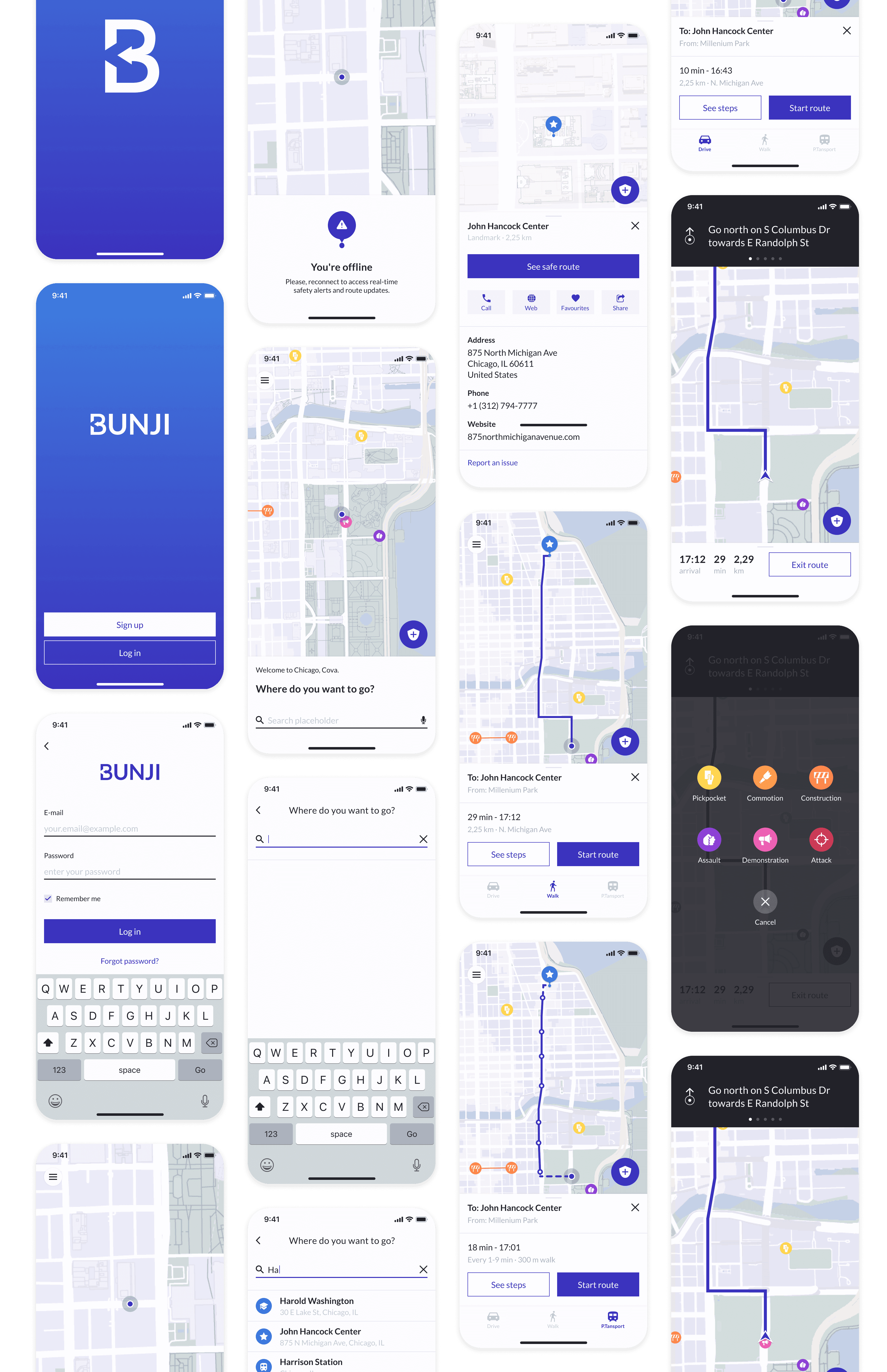
After iterating on feedback from earlier prototypes, went back to high-fidelity screens to refine:
Visual hierarchy for safety cues.
Consistent components and states for alerts.
A calm tone and confidence-building aesthetic that supports trust.

Results
Iteration driven by the usability testing revealed the following:
Improved hierarchy and clarity between mid and high-fidelity iterations.
Stronger comprehension of alert meaning and what action to take (continue, be cautious, reroute).
Qualitative outcome: users reported feeling more supported during route decisions without feeling overwhelmed by fear-based messaging.
01
Comprehension of alert meaning.
Improved UI
02
Confidence during route decisions.
Increased
🚨
Results Caveat
Concept project, I did not have production analytics. Success measured via task completion, clarity of route selection and qualitative confidence feedback.
Learnings
What I've Learned
In safety experiences, tone and hierarchy are a design tool. The UI must inform clearly without escalating anxiety.
Lower-fidelity prototypes are the fastest way to de-risk navigation models and content strategy.
What I'd do differently
Expand research to include more traveller profiles and contexts: late-night arrivals, solo travellers, commuters and different cultural expectations of “safe”.
Run more structured scenario-based tests: time pressure, reroutes due to an alert and conflicting signals.
Next Steps
Explore partnerships or data sources for real time safety signals and define transparency principles for alerts.
Define an MVP analytics plan for “confidence”, for example reroute-after-alert rate, perceived safety score and comprehension checks.
Prototype trust-building features such as verified reporting and clearer signal provenance.


Bunji: safety-first navigation
A safety-first routing experience that helps travellers move through unfamiliar cities with more confidence using safer routes, safety tips and real-time alerts.
2018
-
2-week concept project
· Solo Project · App Design ·
Scroll
Overview
My role
UX & UI
Team Composition
Solo Project: research → synthesis → MVP → prototyping → testing → final UI
When people arrive in an unfamiliar city, most navigation apps optimise for speed, not peace of mind. Bunji was created for travellers who want to reach destinations efficiently while avoiding streets or areas that feel unsafe — building situational awareness especially when they lack local context.
This case study reflects my end-to-end process, from research and problem definition to MVP strategy, information architecture, prototyping, testing and final high-fidelity UI. The goal was to make safety guidance feel actionable and calm at the moment of route decisions.
Challenge
Travellers need a way to understand what is happening around them in real time so they can move through a new city safely and confidently.
Business Goals
Build trust in navigation by helping people make better route decisions before they enter an uncomfortable or risky situation, while still keeping the experience efficient and easy to follow.
Key Pain Points
01
Safety anxiety when navigating unfamiliar neighbourhoods.
02
Lack of situational context during route selection, people only realise "too late" that a route feels wrong.
03
Cognitive load while on the move: limited attention, time pressure and distraction.
Problem to solve
How might we help travellers understand what is happening around them in real time so they can navigate a new city safely and confidently?
Discovery
To understand real traveller behaviour (not assumptions), I ran both quantitative and qualitative research.
Research and discovery methods used:
Online survey: 69 responses
Semi-structured interviews: 4 participants
Research Discovery
01
Worried about safety
71,8%
02
Survey respondents
69
"I am quite oblivious and whenever I am traveling I always end up in uncomfortable and unwanted situations."
Key Insights
Highest-value moment before committing:
Safety is not a niche concern and the highest-value moment is before committing to a route, not mid-navigation.
Clear safety information:
Safety information must be lightweight and decision-ready, not fear-inducing.
Balanced safety and efficiency:
The experience must balance safety and efficiency. It cannot feel like a detour-first product.
Strategy
I translated the research into a clear product strategy and an MVP that could be validated quickly. The priority was to design the safety layer so it complemented the core navigation loop — instead of competing with it.
Strategy methods
Affinity diagram
Clustered themes from survey and interviews to find patterns.
Empathy map
Used to capture anxieties, behaviours and decision triggers.
Persona
Used to represent the target user's context and constrains.
User Journey
Identified high-stress moments and key intervention points.
MoSCoW prioritisation
Used to establish a focused MVP on safer route suggestions, contextual safety tips and real-time alerts.
Sitemap + User flow
Used to established a happy path: Set destination → Compare routes → Navigate → Reroute.
Solution
I designed through progressive fidelity to validate the navigation model early, iterate quickly and reduce costly rework.
Low-fidelity wireframes: used to explore layout and content hierarchy without visual distraction.
Mid-fidelity wireframes: used to validate structure and interaction patterns for route comparison and alert states.
Interactive prototypes: to enable realistic task-based usability testing.
High-fi UI: to polish and apply the final design.
Key screens narrative
Route comparison screen:
The critical decision point. Safety context and route options are surfaced together so users choose confidently before starting.
Progressive disclosure:
Tips and alerts appear contextually to avoid overwhelming the user with fear-based content, minimising alarm fatigue.
Scannability under stress:
Clear hierarchy, consistent alert components and readable typography support on-the-go use when attention and time are limited.
Testing
Task-based usability testing with people from the target group across prototype iterations. Observed confusion, hesitation and collected qualitative feedback.
What usability testing helped uncover
Where users misread safety indicators or hesitated between route choices.
Which alert states required clearer language or more distinct visual treatment.
Moments where the flow added friction instead of confidence.
Final Designs
After iterating on feedback from earlier prototypes, went back to high-fidelity screens to refine:
Visual hierarchy for safety cues.
Consistent components and states for alerts.
A calm tone and confidence-building aesthetic that supports trust.
Results
Iteration driven by the usability testing revealed the following:
Improved hierarchy and clarity between mid and high-fidelity iterations.
Stronger comprehension of alert meaning and what action to take (continue, be cautious, reroute).
Qualitative outcome: users reported feeling more supported during route decisions without feeling overwhelmed by fear-based messaging.
01
Comprehension of alert meaning.
Improved UI
02
Confidence during route decisions.
Increased
🚨
Results Caveat
Concept project, I did not have production analytics. Success measured via task completion, clarity of route selection and qualitative confidence feedback.
Learnings
What I've Learned
In safety experiences, tone and hierarchy are a design tool. The UI must inform clearly without escalating anxiety.
Lower-fidelity prototypes are the fastest way to de-risk navigation models and content strategy.
What I'd do differently
Expand research to include more traveller profiles and contexts: late-night arrivals, solo travellers, commuters and different cultural expectations of “safe”.
Run more structured scenario-based tests: time pressure, reroutes due to an alert and conflicting signals.
Next Steps
Explore partnerships or data sources for real time safety signals and define transparency principles for alerts.
Define an MVP analytics plan for “confidence”, for example reroute-after-alert rate, perceived safety score and comprehension checks.
Prototype trust-building features such as verified reporting and clearer signal provenance.
Bunji: safety-first navigation
A safety-first routing experience that helps travellers move through unfamiliar cities with more confidence using safer routes, safety tips and real-time alerts.
2018
-
2-week concept project
· Solo Project · App Design ·
Scroll
Overview
My role
UX & UI
Team Composition
Solo Project: research → synthesis → MVP → prototyping → testing → final UI
When people arrive in an unfamiliar city, most navigation apps optimise for speed, not peace of mind. Bunji was created for travellers who want to reach destinations efficiently while avoiding streets or areas that feel unsafe — building situational awareness especially when they lack local context.
This case study reflects my end-to-end process, from research and problem definition to MVP strategy, information architecture, prototyping, testing and final high-fidelity UI. The goal was to make safety guidance feel actionable and calm at the moment of route decisions.
Challenge
Travellers need a way to understand what is happening around them in real time so they can move through a new city safely and confidently.
Business Goals
Build trust in navigation by helping people make better route decisions before they enter an uncomfortable or risky situation, while still keeping the experience efficient and easy to follow.
Key Pain Points
01
Safety anxiety when navigating unfamiliar neighbourhoods.
02
Lack of situational context during route selection, people only realise "too late" that a route feels wrong.
03
Cognitive load while on the move: limited attention, time pressure and distraction.
Problem to solve
How might we help travellers understand what is happening around them in real time so they can navigate a new city safely and confidently?
Discovery
To understand real traveller behaviour (not assumptions), I ran both quantitative and qualitative research.
Research and discovery methods used:
Online survey: 69 responses
Semi-structured interviews: 4 participants
Research Discovery
01
Worried about safety
71,8%
02
Survey respondents
69
"I am quite oblivious and whenever I am traveling I always end up in uncomfortable and unwanted situations."
Key Insights
Highest-value moment before committing:
Safety is not a niche concern and the highest-value moment is before committing to a route, not mid-navigation.
Clear safety information:
Safety information must be lightweight and decision-ready, not fear-inducing.
Balanced safety and efficiency:
The experience must balance safety and efficiency. It cannot feel like a detour-first product.
Strategy
I translated the research into a clear product strategy and an MVP that could be validated quickly. The priority was to design the safety layer so it complemented the core navigation loop — instead of competing with it.
Strategy methods
Affinity diagram
Clustered themes from survey and interviews to find patterns.
Empathy map
Used to capture anxieties, behaviours and decision triggers.
Persona
Used to represent the target user's context and constrains.
User Journey
Identified high-stress moments and key intervention points.
MoSCoW prioritisation
Used to establish a focused MVP on safer route suggestions, contextual safety tips and real-time alerts.
Sitemap + User flow
Used to established a happy path: Set destination → Compare routes → Navigate → Reroute.
Solution
I designed through progressive fidelity to validate the navigation model early, iterate quickly and reduce costly rework.
Low-fidelity wireframes: used to explore layout and content hierarchy without visual distraction.
Mid-fidelity wireframes: used to validate structure and interaction patterns for route comparison and alert states.
Interactive prototypes: to enable realistic task-based usability testing.
High-fi UI: to polish and apply the final design.
Key screens narrative
Route comparison screen:
The critical decision point. Safety context and route options are surfaced together so users choose confidently before starting.
Progressive disclosure:
Tips and alerts appear contextually to avoid overwhelming the user with fear-based content, minimising alarm fatigue.
Scannability under stress:
Clear hierarchy, consistent alert components and readable typography support on-the-go use when attention and time are limited.
Testing
Task-based usability testing with people from the target group across prototype iterations. Observed confusion, hesitation and collected qualitative feedback.
What usability testing helped uncover
Where users misread safety indicators or hesitated between route choices.
Which alert states required clearer language or more distinct visual treatment.
Moments where the flow added friction instead of confidence.
Final Designs
After iterating on feedback from earlier prototypes, went back to high-fidelity screens to refine:
Visual hierarchy for safety cues.
Consistent components and states for alerts.
A calm tone and confidence-building aesthetic that supports trust.
Results
Iteration driven by the usability testing revealed the following:
Improved hierarchy and clarity between mid and high-fidelity iterations.
Stronger comprehension of alert meaning and what action to take (continue, be cautious, reroute).
Qualitative outcome: users reported feeling more supported during route decisions without feeling overwhelmed by fear-based messaging.
01
Comprehension of alert meaning.
Improved UI
02
Confidence during route decisions.
Increased
🚨
Results Caveat
Concept project, I did not have production analytics. Success measured via task completion, clarity of route selection and qualitative confidence feedback.
Learnings
What I've Learned
In safety experiences, tone and hierarchy are a design tool. The UI must inform clearly without escalating anxiety.
Lower-fidelity prototypes are the fastest way to de-risk navigation models and content strategy.
What I'd do differently
Expand research to include more traveller profiles and contexts: late-night arrivals, solo travellers, commuters and different cultural expectations of “safe”.
Run more structured scenario-based tests: time pressure, reroutes due to an alert and conflicting signals.
Next Steps
Explore partnerships or data sources for real time safety signals and define transparency principles for alerts.
Define an MVP analytics plan for “confidence”, for example reroute-after-alert rate, perceived safety score and comprehension checks.
Prototype trust-building features such as verified reporting and clearer signal provenance.